
Gen 5 Historia: Character Development
Professor Juniper was a fat man, Masuda created N, and more
Written by Dr Lava, July 6 2019
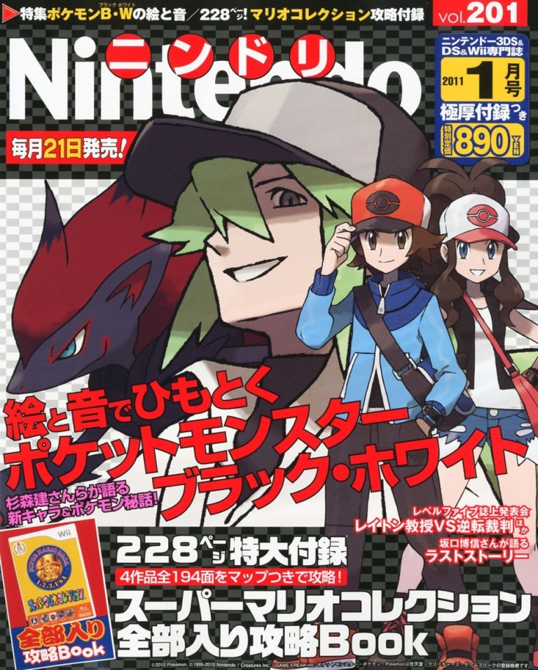
The following interview was originally published in the Jan 2011 edition of Japanese magazine Nintendo Dream. This is the first time this interview has been translated and made publicly available in English, as were all three interviews I published last month — in case you missed them, those interviews contained information about tank dragons, scrapped Grass and Ghost Pokemon, Ken Sugimori’s unused idea for the world’s smallest Pokemon, and many other monster designs that ended up going unused in Generation 5.
Interview Preface
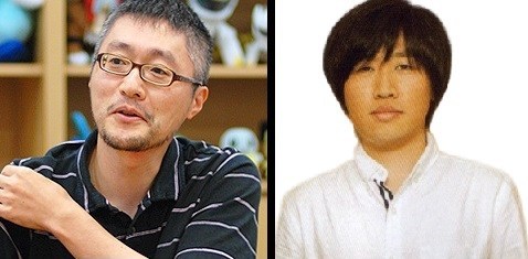
The interview you’re about to read contains even more revelations about Black & White’s development — but this time, regarding the origins of the games’ human characters. Some photographs from a 2012 fan event in Japan are also included, as well as relevant information from other sources. This article’s highlights include pre-release character concept art, the story of how Professor Juniper was transformed from a fat man into the Pokemon games’ first female professor, and even glimpses of the interviewees’ personalities, which we just didn’t get a chance to see when they were interviewed about Pokemon designs. The following interview is conducted with art director Ken Sugimori and character designer Yusuke Ohmura — who eventually took over Sugimori’s position as art director for Sun & Moon.
If you’re interested in this kind of content, you might wanna subscribe to my YouTube channel about lost Pokemon history, where information from official interviews, concept art, and internal data is documented and analyzed — for instance, my most recent video showcased the world’s first-ever recording of Gen 5’s lost Lock Capsule event.
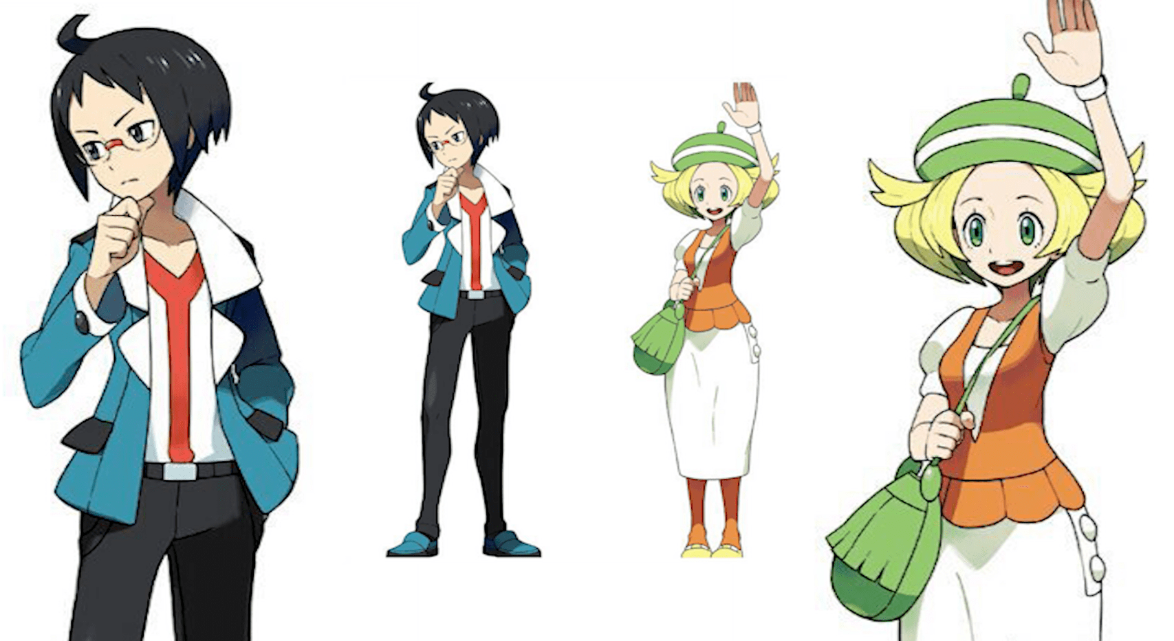
Protagonists: Hilbert • Hilda
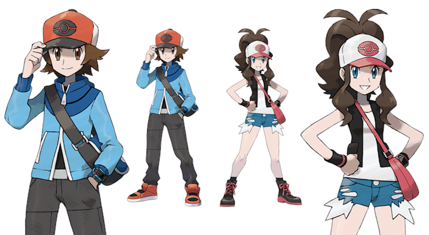
Sugimori: “So this time we received orders from Masuda to increase the ages of Black & White’s protagonists, to make them older than the 10 or 11 year olds we used in previous games. Series protagonists typically wear hats and carry backpacks, and these elements are usually the starting points for our designs. So we were trying to decide what characteristic to add next. At this point, Masuda had already created N, and the design he’d given us showed N also wearing a hat. Now, a character like N doesn’t fit the mold of a typical series villain — we’d been told that in this game, the villain’s sense of morality was actually closer to that of the protagonists. So we figured, well, maybe it would be fun to just have them all wear hats.”
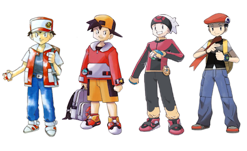
Sugimori: “We’d had male protagonists wear caps before, but we hadn’t had a female protagonist wear one yet. Next, we thought about what kind of clothes this girl should wear besides a hat, and we agreed on stuff like shorts. We observed girls making their way around town and we tried out a few different ideas — like maybe this, or more of that. And then we combined all these ideas and ultimately we landed on the design we have now. Hilbert was sort of the reverse of Hilda in comparison — so thinking about balance, we thought why not give the boy sort of a vibe of coolness this time around? Now, I don’t usually like characters that are too cool, so in the past I’ve wanted to avoid doing this as much as possible (laughs). In Pokemon Diamond & Pearl and Pokemon Ruby & Sapphire, we made the protagonists energetic and hot blooded with short hair, but this time we were aiming for something cooler. We finished up their designs with stuff like stylish haircuts.”
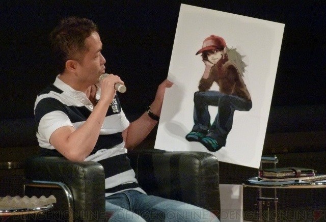
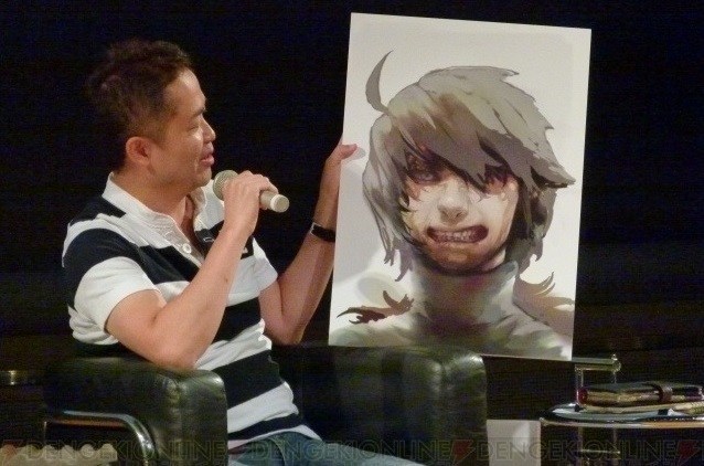
Dr Lava’s notes: Sugimori tells us way more than we need to know about hats, but it’s interesting to hear him say that he doesn’t think previous male protagonists were cool, and that he even has a personal distaste for cool characters. I should point that while Sugimori says Gen 5 director Junichi Masuda was N’s creator, that original N design ended up getting revised pretty heavily by Game Freak’s design team. At a fan event in August 2012, Masuda revealed the original N from Black & White’s development (pictured above). But more on that later.
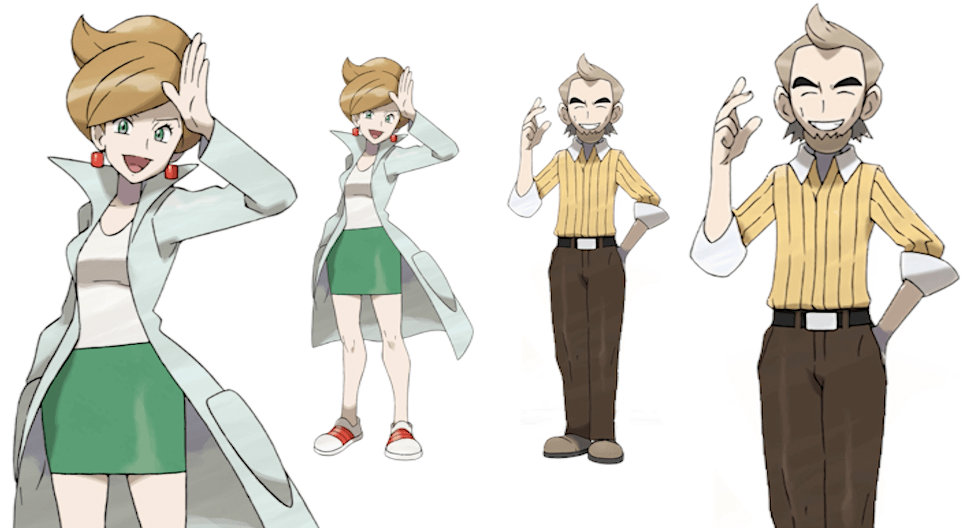
Professor Juniper • Cedric Juniper
Sugimori: “Up until halfway through development, both professors were actually men. We’d received orders with very unpleasant requirements — that one professor should be fat, and other one old (laughs). But there was a severe lack of anything feminine or pleasant about that situation. So I went and complained to Masuda — I told him, “Make the professor a woman!” (laughs). I’d actually been thinking about handing over the responsibility of designing the professor to Ohmura, but I was the one who’d proposed the changes, so I decided to design her myself. I thought she would be kind of a New Yorker type — in other words, a real career woman. Maybe she’s the kind of woman that would wear sneakers around the office, that kind of vibe. After Juniper was changed into a woman, we revised Cedric’s design as well — in order to make him look like he could actually be the other professor’s father.”
Dr Lava’s notes: So originally, Professor Juniper was a fat man, and specifications were handed down that Cedric should be old — although Sugimori doesn’t clarify here if Cedric was always meant to be the father of the younger professor. First appearing in season 2 of the anime, Professor Ivy was actually the first female professor to be introduced in series canon. But as far as the Pokemon video games are concerned, it wasn’t until Sugimori insisted to Masuda that Juniper be revised into a woman that the series received its first female professor. I should note that Sugimori doesn’t usually design human characters himself — in Gen 5, that was primarily Ohmura’s job. But apparently in this instance, Sugimori felt strongly enough that he decided to handle the design personally.
Cheren • Bianca
Ohmura: “The basic design concepts that the scenario writers gave us served as our starting point for Cheren and Bianca’s designs. Cheren’s a guy who’s really kind of inflexible, but intellectual, whereas for Bianca we were only given the description of a “pure-hearted girl who dances to the beat of her own drum.” Other than those specifications, we really had a lot of freedom for these two characters’ designs. There are parts of the game where the protagonist, Cheren, and Bianca all have battles, but they’re not your typical rival characters — they’re really more allies and supporters of the protagonist, so we tried to make them easy to get along with, without being too serious in nature. As for Cheren, the Pokemon series hadn’t featured any regular dark-haired young boys with glasses so far, so we agreed on his characteristics of having dark hair and approachability without much hesitation. We also had this idea that maybe he’s the head of a student council, so we had him wear this style of jacket. So far in the series, all the young boys who wear neckties have been pompous and smug, so we were able to reduce that by having the design of his inner shirt only look like a necktie from a distance.”
Ohmura: “Bianca’s design was started in the latter half of development. At that time, the designs of all the female Gym Leaders were already decided, but later on when we reviewed them, we realized most of them were pretty peculiar. We didn’t have female character designs that used a lot of round lines, or were all that child-like. So we wanted to differentiate Bianca from Hilda, who we’d already given a more sporty kind of vibe. We’d decided Hilda would wear shorts, so we thought — well, how about Bianca doesn’t show as much skin? With both Cheren and Bianca, we didn’t want them to be a pair of characters that were too cool or showy. For example, Elesa’s a model, and that’s just not a very relatable lifestyle. I’d regard that as a kind of charisma that’s out of reach for most people. In contrast to a character like Elesa — while I don’t think this is the best way of describing it — I wanted them to be characters that maybe aren’t so good looking or stylish. We finished up Cheren and Bianca’s designs with the concept that they’re the kind of characters who are more bold when they team up together.”
Dr Lava’s notes: Sugimori says that previous young tie-wearing characters have all been “pompous and smug,” so he decided to go a different direction with Cheren. But I think some fans still consider Cheren as just one more in a long line of pompous tie-wearers, and th fact that he’s apparently head of his student council — well, that’s probably just going to make him come off as even more pompous.
It’s interesting how often Sugimori says he doesn’t like creating characters who are too cool or attractive. You get the impression maybe he doesn’t see himself as too cool or attractive. Unlike the Pokemon origins stories published on this website recently, readers really get a chance to see small glimpses of Sugimori’s personality peek through during this interview about Black & White’s human characters. Further down in this interview, you’ll see Ohmura’s personality peek through as well.
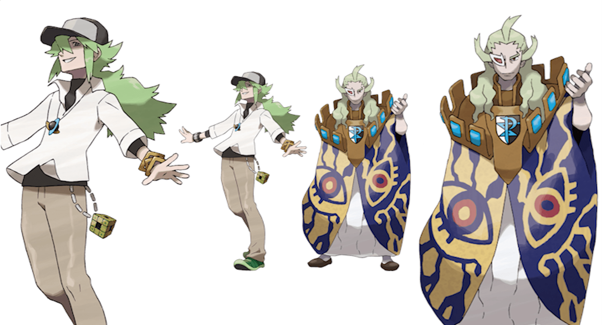
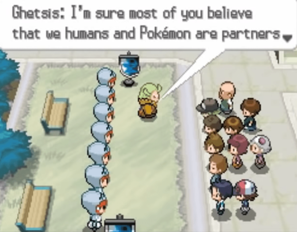
N • Ghetsis
Sugimori: “N was designed around original concept art provided by Masuda. Basically, he gave us orders to design a kind of genius character — which prompted a woman who worked under Masuda as a designer to ask “What is genius?” After giving her question some thought, we came up with N’s androgynous appearance, and that he’s kind of an artistic type of guy — a foe who’s maybe not necessarily a foe at all. N is a cool and attractive looking guy, which is an impression you’re supposed to get from his poses, but he’s just a little bit different from the average person (laughs). In his genius he has a very dangerous air about him. There were specific details provided from above, and N’s designer drew him based on those specifications. As for Ghetsis, we wanted something quite unusual, like wearing some pretty strange clothes and having this weird, extraordinary form. Team Plasma itself has the appearance of soldiers from the middle ages, right? And their logo has that same vibe. But actually, we had our reservations about the design of the Team Plasma Grunts every single day. Ohmura designed the grunts, by the way.”
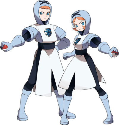
Ohmura: “We decided on the concept of ‘a group of soldiers who protect a king.’ For me, the shape of their heads was quite the adventure – depending on your point of view, they look kind of stupid (laughs). But they are grunts after all, so I figured that looking kind of dumb might be alright. The male and female grunts look pretty similar, so I was wondering what to do about that. But when a group of grunts actually appears on the field in-game, they have all these round heads and it looks kind of strange. I thought that was actually pretty cool.”
Dr Lava’s notes: While Masuda may have created N and come up with his initial design, clearly his original vision for the character was revised pretty heavily by the design team. In Masuda’s artwork, N exudes a much more menacing presence, and doesn’t exhibit the androgynous features present in his final design. His clothes, hat, and general aura have changed completely. Sugimori says there were “very specific details provided from above,” presumably by Masuda, but unfortunately the only detail Sugimori shares with us is “genius.” Considering how different Masuda’s N was from that of the design team, it makes you wonder what exactly was on that list of character specifications.
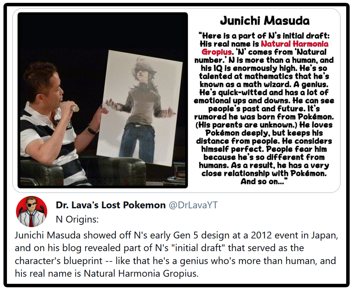
Although Masuda created N and made his original concept art, character designer Keiko Moritsugu has claimed credit for the artwork pictured above. As director, Masuda typically delegated this kind of work to his staff — after all, he’s not a trained artist. Unfortunately, Masuda’s original concept art for N has never been published — although he did share N’s “initial draft” on his blog. A translation of that draft is pictured above, originally posted to my Twitter.
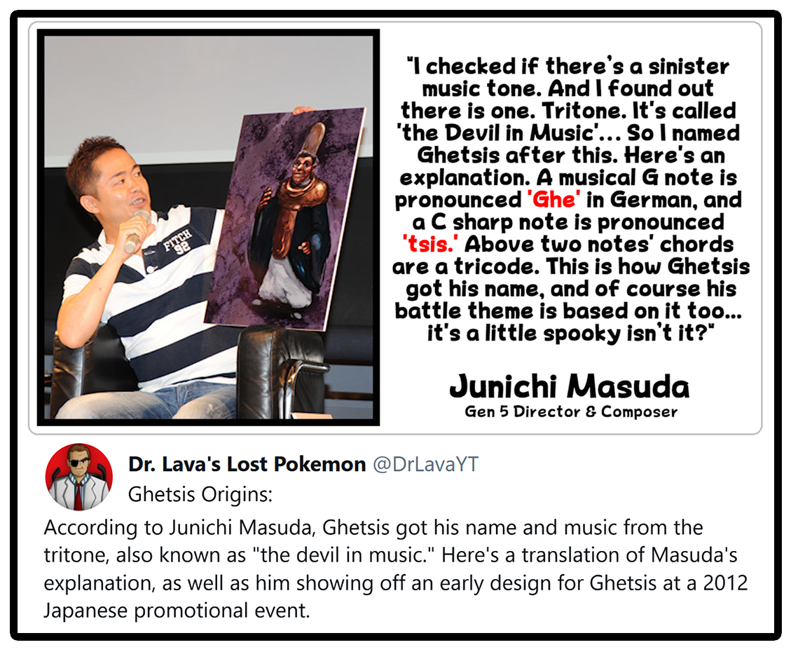
At that 2012 fan event, Masuda also showed off early concept art for Ghetsis. He appears to have originally been much older, creepier, and more priestly. He’s also much shorter — Ghetsis’ final design is said to be 2 meters tall (6’6″). Masuda also revealed the origins of Ghetsis’ name and music on his blog, translated above. And below you can hear the Ghetsis battle theme that Masuda’s talking about with the G and C notes.
Ohmura describes the shape of the grunts’ heads as “an adventure,” which makes it sound like he went through quite a few different designs, and wasn’t particularly satisfied with any of them. Sugimori and Ohmura don’t even sound very pleased with the designs that ended up being used in the games’ final build. But I guess they couldn’t come up with anything they liked better.
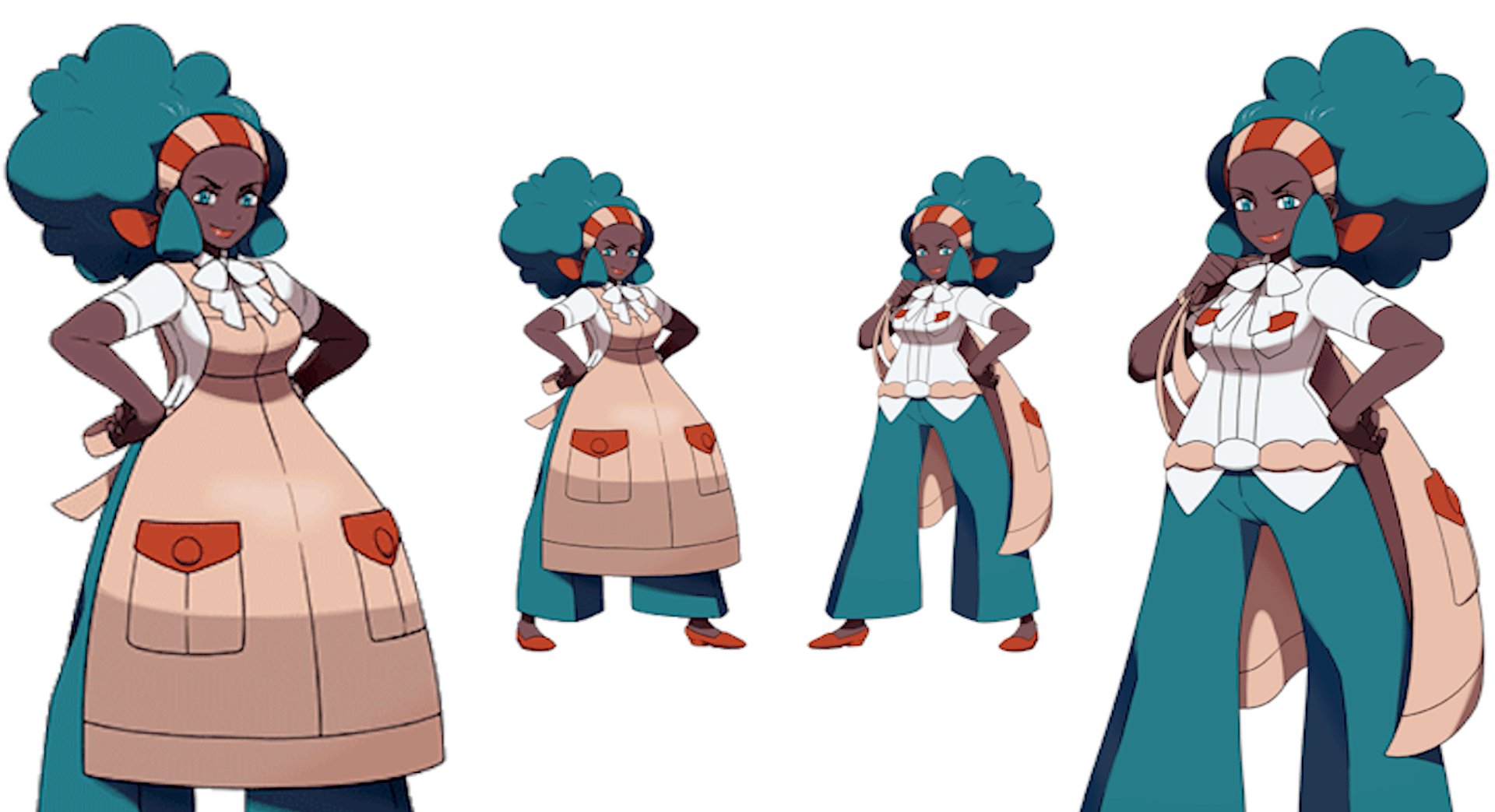
Lenora
Ohmura: “If I was going to sum up Lenora with just a few words, I’d say she’s a mother with a lot of spirit. There was talk during Black & White’s development about wanting to focus on the inclusion of a multinational and multiracial vibe. So with that in mind, we came up with this black woman, and we’d received orders that she should have a strong sort of body type and some motherly qualities. So we added the apron when thinking about this motherly concept, but actually, the apron made Lenora give off the impression that she was just an average mom. So because she works as the head of the Nacrene Museum, discovering fossils and stuff like that, we tried incorporating elements of a kind of ‘work apron’ that could be useful in dealing with such a wild kind of job. We hadn’t had a Gym Leader that wears an apron before, so we figured that was another good reason to have Lenora wearing one.”
Dr Lava’s notes: Lenora’s original artwork referenced here by Ohmura was actually quite controversial, and ended up getting revised soon afterwards into the artwork seen above, where the apron is slung over her shoulder. While Game Freak’s intention may have been the inclusion of a racially diverse cast of characters, for some fans, Lenora’s design was an unwelcome addition.
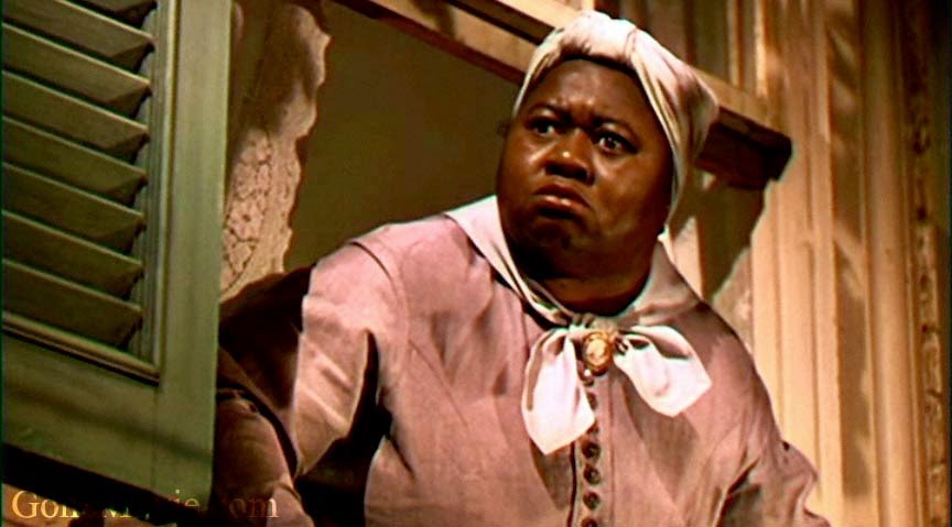
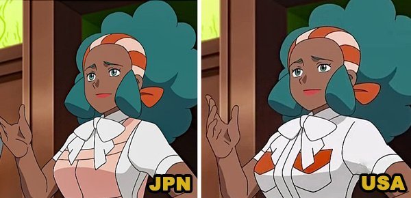
Lenora’s original artwork was seen by some detractors as an example of the “mammy” housekeeper stereotype, which was made even worse by the fact that her Gym Leader title in the original Japanese version was ナチュラル ボーン ママ , which means “Natural Born Mama.” Internationally, her title was changed to “An Archaeologist with Backbone.” Also, three episodes of the Black & White anime had Lenora’s apron censored out when aired overseas, and it was also removed from international releases of the Pokemon Adventures manga.
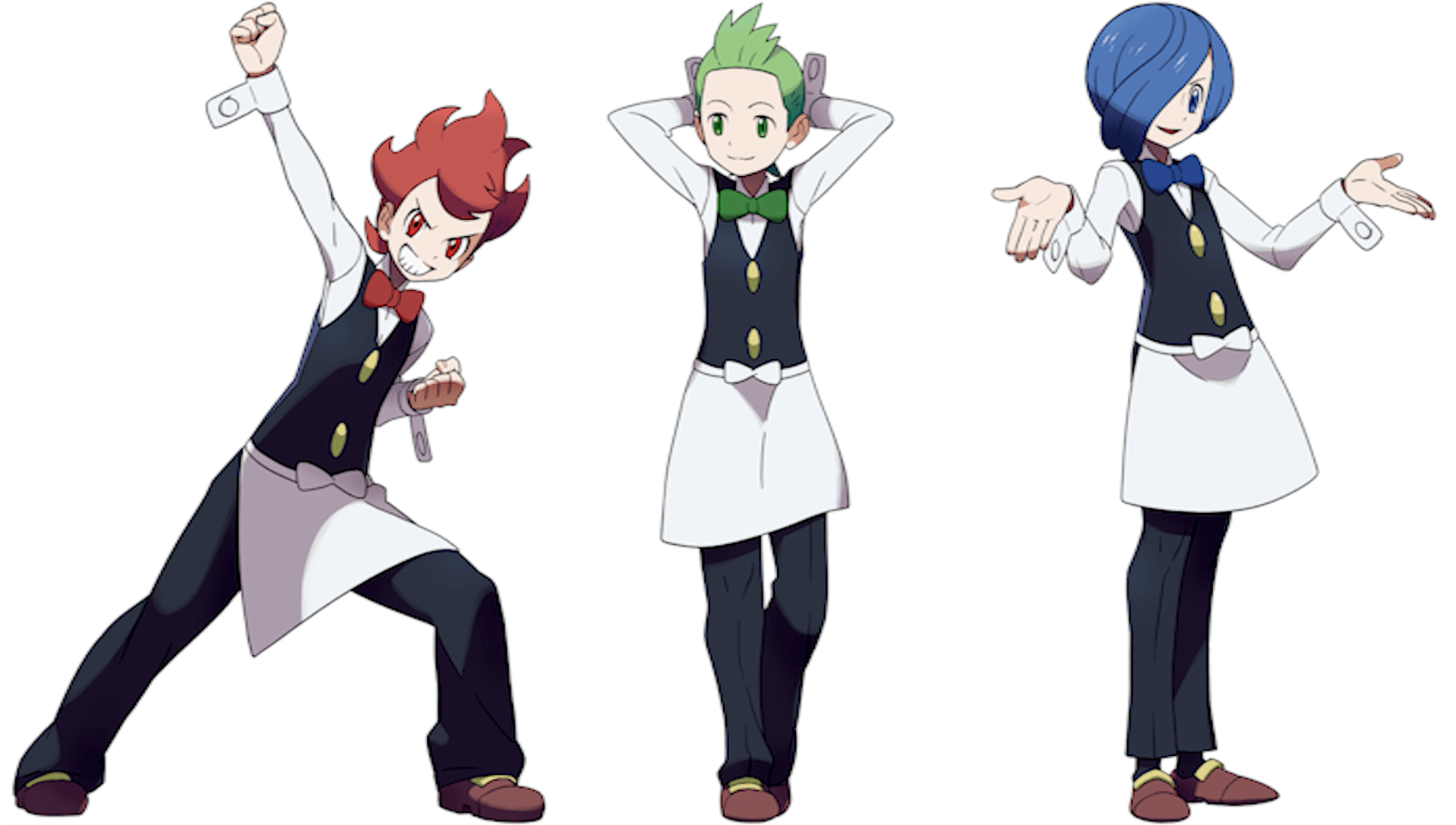
Chili • Cilan • Cress
Ohmura: “So we came up with these three triplets, but they didn’t end up looking all that much alike (laughs). Actually, we were ordered to give them all the same face, but for the first gym of a brand new Pokemon title, our design team thought it would be pretty dull for them to all look the same. I thought instead, we should give each of them some individuality. These triplets are the first characters in the game that require the player to understand type affinities, so we decided that the player should be able to know what type’s going to be used just based on their appearance. Looking at each of their hairstyles, Chili looks like he’s got fire burning atop his head, Cilan’s looks like grass, and Cress’ looks like flowing water. We were careful not to make their appearance too over-the-top, so we wouldn’t be getting in the way of the original concept that they’re all waiters.”
Dr Lava’s notes: Sugimori and Ohmura repeatedly make reference to receiving orders from above — usually from Masuda or the games’ planners — to design a character with a particular set of specifications. So it’s interesting to hear about the instances where they push back, like with Juniper and these triplets. In case you’ve forgotten, the triplets were co-leaders of the restaurant-themed Striaton City gym, with each brother’s team including either Pansage, Pansear, or Panpour.
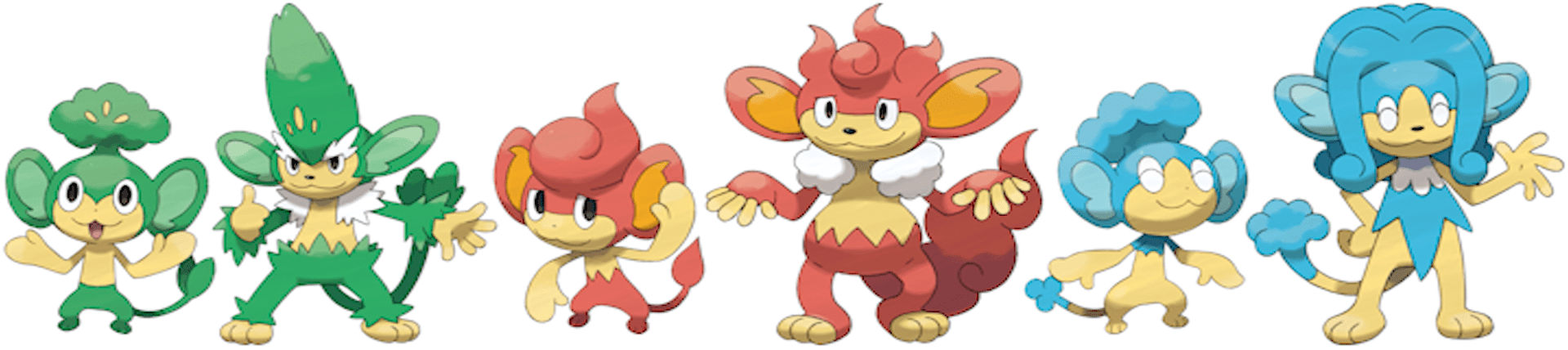
In the previous interview translation published on this website, Takao Unno goes into great detail about his thought process while designing the Elemental Monkeys, and how the concept for the restaurant gym not only came first, but heavily influenced the monkeys’ designs. If you’ve got a special interest in the Striaton City gym or the Elemental Monkeys, you might want to check out that interview.
Burgh
Ohmura: “We were told to come up with a cool artist who’s a stylish guy, but designing him proved difficult for me. I didn’t really know what being a stylish guy really meant (laughs). We’d already done a straightforward attractive-looking guy with the design for N, and there were specifications about maybe giving Burgh long hair. But if we did that, we would have ended up with two characters with the exact same features. So even though Burgh is definitely cool, I wanted him to have a kind of lovable charm to him too, so I decided on tousled hair with a shape that maybe wasn’t set so perfectly. And then I took some female staffers aside and asked them, “Who’s your idea of a cool guy?” (laughs). Burgh’s design was the result of the opinions they shared, with his eyes slightly drooping and stuff like that. Although he’s got these drooping eyes, we also chose some features like the bridge of his nose being straight. I figured, “Jeez, if all these female staffers like these kinds of features, I’d better implement them into Burgh’s design (laughs).”
Sugimori: “An objectively cool guy, huh? (laughs)”
Ohmura: “But really, we asked so many people and the same names just kept coming up. There really does seem to be a standard for what a lot of people happen to think is cool.”
Dr Lava’s notes: Here’s where you really get a glimpse of the real Ohmura. Clearly, he doesn’t think of himself as a cool or stylish guy. It sounds like that list of names that “just kept coming up” among the ladies in the office about who they think is cool, didn’t include his own.
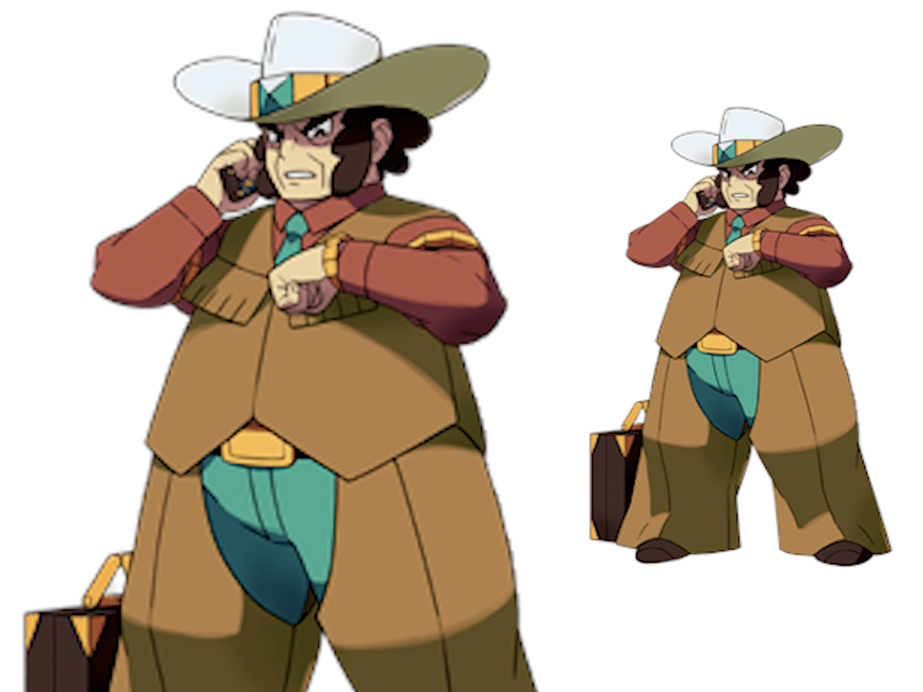
Clay
Ohmura: “Designing this character was incredibly difficult. First of all, he’s a tycoon and president of a mining company. And he’s also based on people of Japanese descent who live outside of Japan — we’ve heard about the kind of people who move abroad, and are out chasing the American Dream. In thinking about these pioneering types, we decided on Clay’s old-fashioned western outfit. During Black & White’s development, there was talk about giving all the Gym Leaders different body types — so in contrast to Elesa, we narrowed the shoulders and made Clay short, stout, and kind of rotund. He’s a company president, but he’s not the kind of guy who’s always sitting at his desk — rather, there was a specification for him to be the type of guy that doesn’t delegate things he can do himself. We also gave him a cellphone and other things to hold, to give the impression he’s a pretty busy guy.”
Dr Lava’s notes: Most Gen 5 fans will probably be surprised to hear that Clay is meant to be of Japanese descent. With Unova based on New York and home to a diverse population, many probably assumed Clay to be the cliché of how the Japanese might perceive a stereotypical Texas oilman. It’s also interesting to hear Ohmura say that Clay’s shape was chosen for the sake of variety. By the sound of things, the designers wanted all the Gym Leaders to exhibit different body types — and when they realized there wasn’t a fat one yet, the duty fell upon Clay to pile on the pounds.
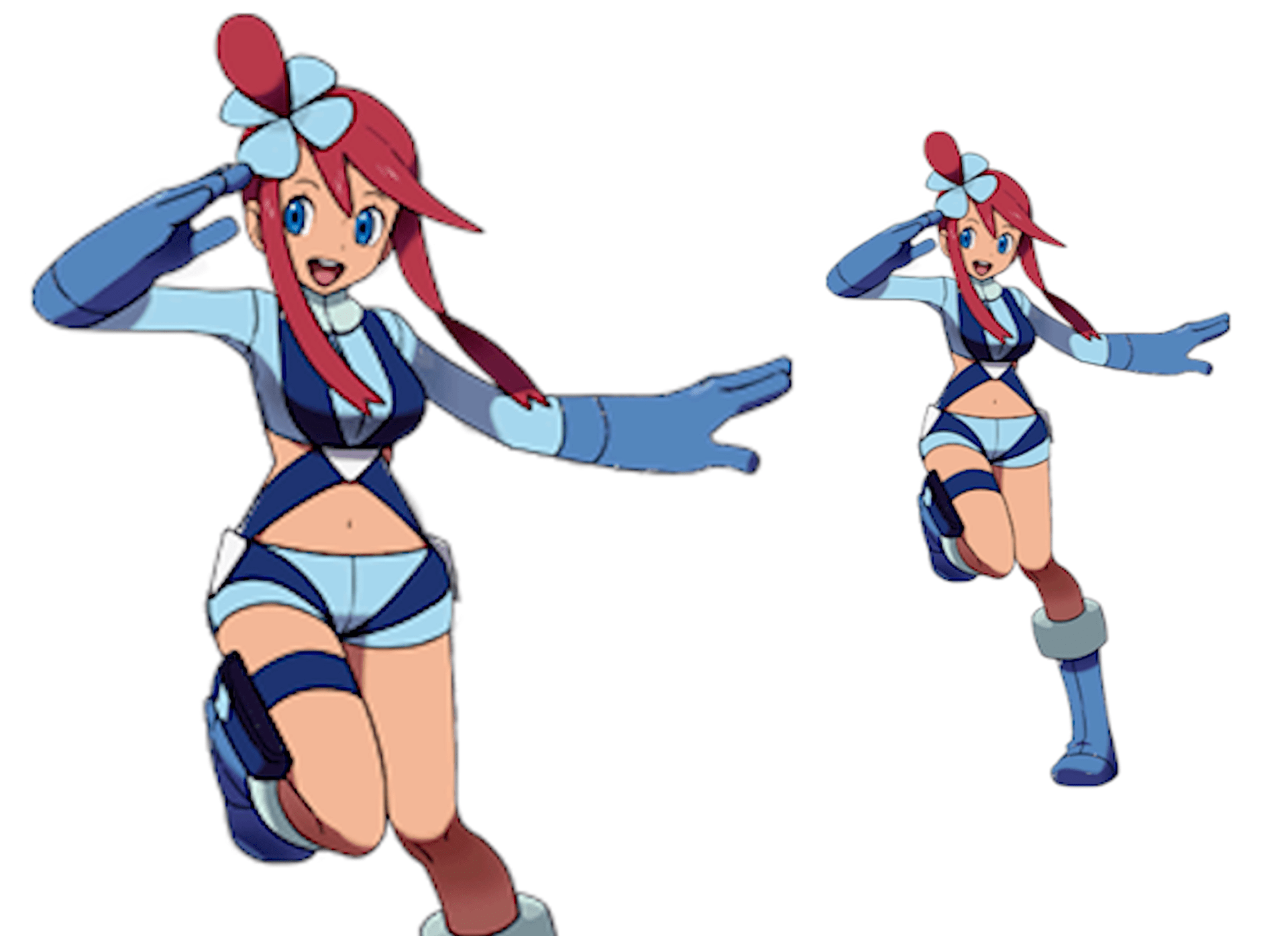
Skyla
Ohmura: “Initially, we were told to design Skyla as a caring older sister, and she would do things like carry luggage around the airport, pilot a cargo plane, and rally all the men. Her early designs gave her this wild kind of facial expression, but we thought maybe the idea of a caring older sibling character had kind of been done already. I said I’d really prefer we make her into your standard cute young girl, which resulted in the design we have now. We figured this was a pretty good way to go, considering the variation between all eight Gym Leaders. Although Skyla’s a pilot, her outfit still has traces of her early designs when she was going to be a slightly sexy young girl. The bags attached to her thighs are described as holding Pokéballs. We figured these were kind of like little holsters someone might typically use to hold gun magazines, but instead Skyla fills them with Pokéballs — when she takes one out, the next one is ready to go. We added these holsters as a way to accentuate her design.”
Dr Lava’s notes: That first sentence might be a little confusing for fans who haven’t played Black & White recently. Skyla carries luggage and flies a cargo plane because the Mistralton Gym is airport-themed. It makes sense for Ohmura to say she “rallies all the men” because, except for Gym Leader Skyla herself, all the gym’s trainers are men — two Pilots and three Workers. While her outfit may seem a skimpy for a cargo plane pilot, Skyla’s design does make a little more sense now that Ohmura’s told us that her original design was “a slightly sexy young girl.”
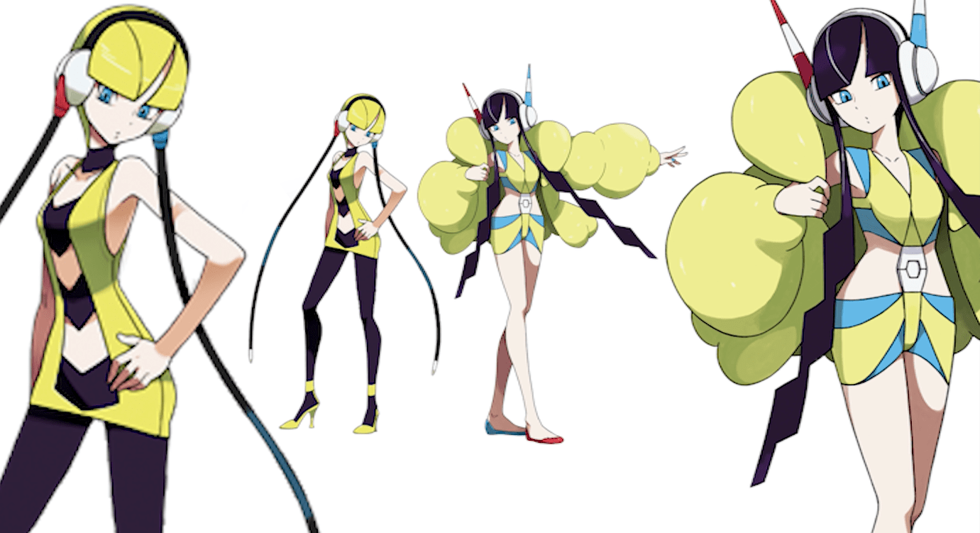
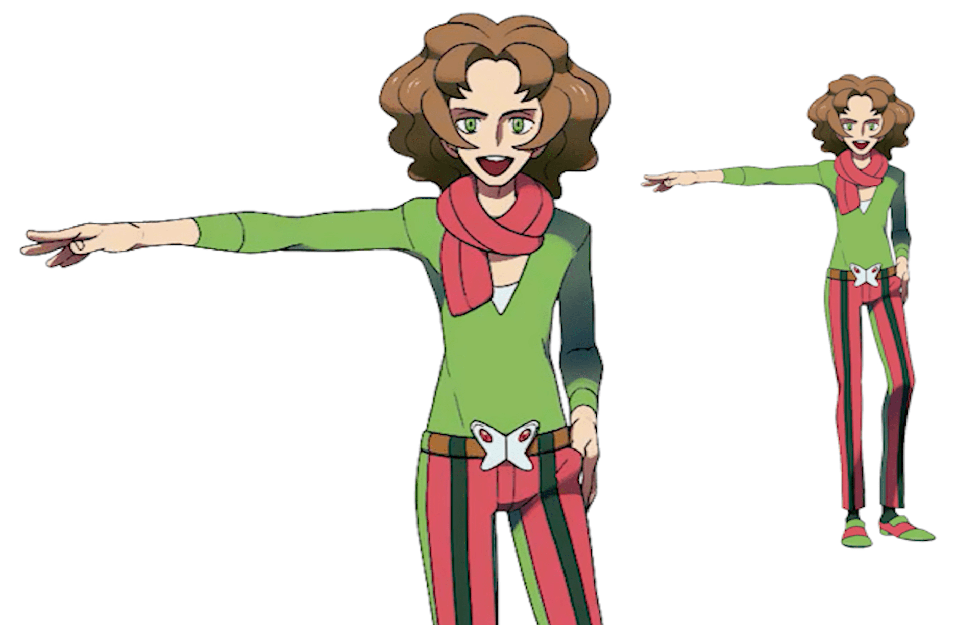
Elesa
Ohmura: “Since Elesa’s a model, we wanted to give her these long legs to set her apart from all the other characters. We thought maybe she’d end up feeling out of place — but as a model, that was actually the impression we wanted her to give off.”
Sugimori: “Even with models in real life, they often have those almost inhuman but attractive faces.”
Ohmura: “We started with our own personal ideas for this design, but we wanted to get across the idea that models really do have these bodies that are different from those of martial artists and fighters, and that Elesa’s figure was something she’d worked hard and trained for. When you see a fashion show, the models often walk with a lack of any expression, and the way they turn back around when they walk makes them look kind of like robots. We designed Elesa with that in mind, thinking she should have a mechanical look. Ultimately, she ended up with a slightly android kind of design. She’s the gym leader that uses Electric types after all, so that seemed to mesh well with her android appearance. Originally she didn’t have the long cords hanging from her headphones, but the game’s scenario writers told us that Elesa ‘listen to music a lot,’ so we decided to add them. The cords also kind of look like long strands of hair, and since she’s got sort of a robotic-looking face, we like to think the whole thing came together pretty well.”
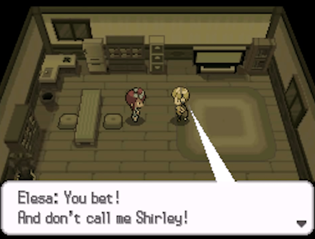
Dr Lava’s notes: Elesa was the only Gym Leader to receive a character redesign for Black & White 2. In the sequels, Elesa further embraces her super-model status — she wears more extravagant and revealing clothes, grows her hair out and dyes it black, and even converts the Nimbasa City Gym from a roller-coaster ride into a catwalk. But despite her super-model facade, Elesa’s personality is somewhat humanized. She reveals to Skyla that she’s self-conscious about people’s perceptions of her, and says others probably don’t think she’s much fun due to her stunningly good looks. She then rattles off a series of bad puns that fail to land with Skyla, concluding with a reference to the classic 1980’s comedy Airplane!, telling Skyla: “And don’t call me Shirley!”
More Translations On the Way
And that wraps up Nintendo Dream volume 201’s feature on the origins and development of Gen 5’s human characters. If you want to read more developer translations, there are plenty more already available on this website’s homepage. And more are currently in progrress. If you want to contact me about this translation, or for any other reason, the easiest way to reach me is on Twitter, where I’m @DrLavaYT. And if you like watching videos about Pokemon’s development process, you might wanna check out my YouTube channel.
In addition to all the time spent putting these translations together, many of the original Nintendo Dream magazines still need to be located, purchased, shipped from Japan, scanned, translated, and in some cases have original artwork curated. These translation projects consume a lot of time and resources, so if you’d be willing to support my work for a few bucks a month via Patreon, it’d really mean a lot. And it helps guarantee more translations and original video content can continue into the future.
Related Articles:
• Ken Sugimori Reveals Origins of Gen 5 Pokemon Designs
• Gorochu: Developer Translations and the 2019 Leak
Related Videos: