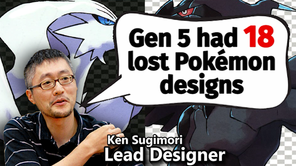
Gen 5 Historia: Pokemon Origin Stories (Part 2)
Lost Pokemon revealed, design origins explained
Written by Dr Lava, May 31 2019
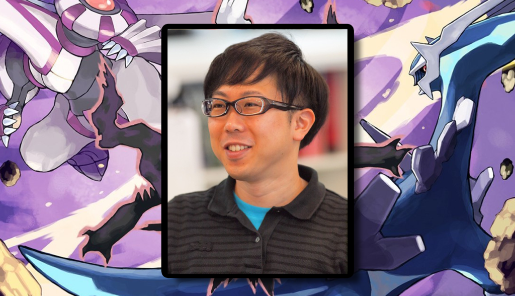
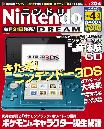
The following interview was published in Nintendo Dream volume 204, the April 2011 edition. This was the second of three interviews, in which over a hundred Gen 5 Pokemon had their design origins explained to the magazine’s subscribers. This is the first time this interview has been translated into English and made publicly available. The same goes for volume 201’s interview and volume 205’s interview, which have also been translated and published on this website. In the following interview, lead Pokemon designer Ken Sugimori is joined by two more designers: Takao Unno (who later served as director for Black and White 2) and Yusuke Ohmura (who took over Sugimori’s position as lead designer for Sun and Moon).
Interview Preface
The interview you’re about to read contains even more fascinating revelations about Black & White’s development — for example, Stunfisk was originally a half-Electric blue goosefish, the Petilil family was initially a three-stage evolutionary line but ended up getting cut down to just two, and the Litwick family’s designs were once vastly different. Throughout this article, I’ll inject some of my own commentary to provide context. It’ll be clearly labeled with italics.
If you’re interested in this kind of content, you might want to subscribe to my YouTube channel about lost Pokemon history, where information from official interviews, concept art, and internal data is documented and analyzed — for instance, many of these three translations’ highlights are analyzed in episode 21 of my channel. So if you prefer watching videos to reading, that might be a good way to absorb this information.

Note to YouTubers & webmasters: These translations were commissioned for the purpose of documentation on my channel, and were tracked down and translated at considerable effort and cost. But if you’re a content creator yourself and would like to share this information with your followers, that’s A-OK with me — I only ask that you take a few seconds to recommend and link to my YouTube channel for the translation, as this website is an extension of my channel. When large websites and YouTubers repost my work without citation — thereby claiming all the credit and traffic for themselves — it makes these projects more difficult to continue into the future, as they’re funded primarily by readers’ donations. So please extend that courtesy. Okay, so now that we’ve got all that out of the way, on to the interview:
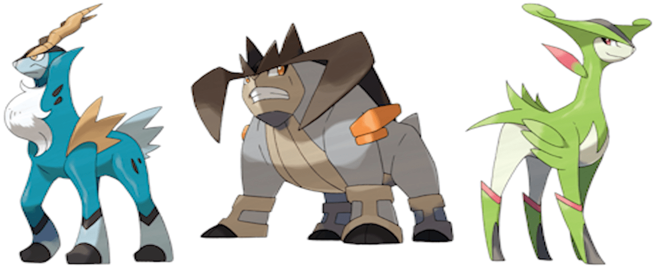
Cobalion • Terrakion • Virizion
Sugimori: “These three were designed by Mr Unno. These designs are meant to represent the Three Musketeers — Cobalion is Athos, Terrakion is Porthos, and Virizion is Aramis. These Pokemon are clever. Cobalion has a sharp horn that pierces through his opponents. Virizion moves swiftly and then cuts the enemy with his horn. Terrakion’s horn was modeled after an axe — he uses it to stop the enemies’ blow then push them back.”
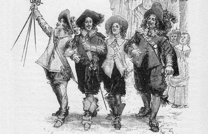
Dr Lava’s notes: Takao Unno also designed at least five more Pokemon for Generation 5 — Pansage, Pansear, Panpour, Rufflet, and Braviary. The Three Musketeers, in case you didn’t know, are the 17th century team of fictional French adventurers who are best known for their motto, “All for one and one for all.” Athos is the trio’s well-rounded leader, Porthos is the largest and strongest of the group, and Aramis is the romantic pretty-boy. The Three Musketeers are often accompanied by D’Artagnan, the group’s newest and youngest member, who’s likely meant to be represented by Keldeo.
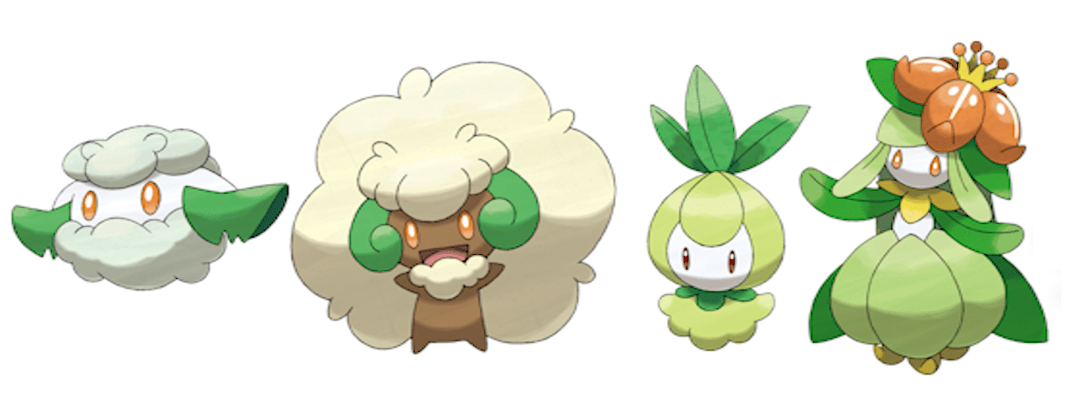
Cottonee • Whimsicott • Petilil • Lilligant
Sugimori: “These were all designed by Atsuko Nishida. We had designed too many Grass type Pokemon, but it would have been a shame to throw them out. So rather than discard them, we made them version exclusives. The charm of Cottonee and Whimsicott is that they resemble sheep. Petilil and Lilligant were originally meant as a three-stage evolutionary line. Lilligant was designed to give the impression of an ‘extravagant princess.’”
Dr Lava’s notes: Atsuko Nishida has been a Game Freak monster designer since the very beginning, and she rarely receives the credit she deserves for her contributions to the franchise — she designed many of the series’ most iconic Pokemon, including Bulbasaur, Charmander, Squirtle, and Pikachu.
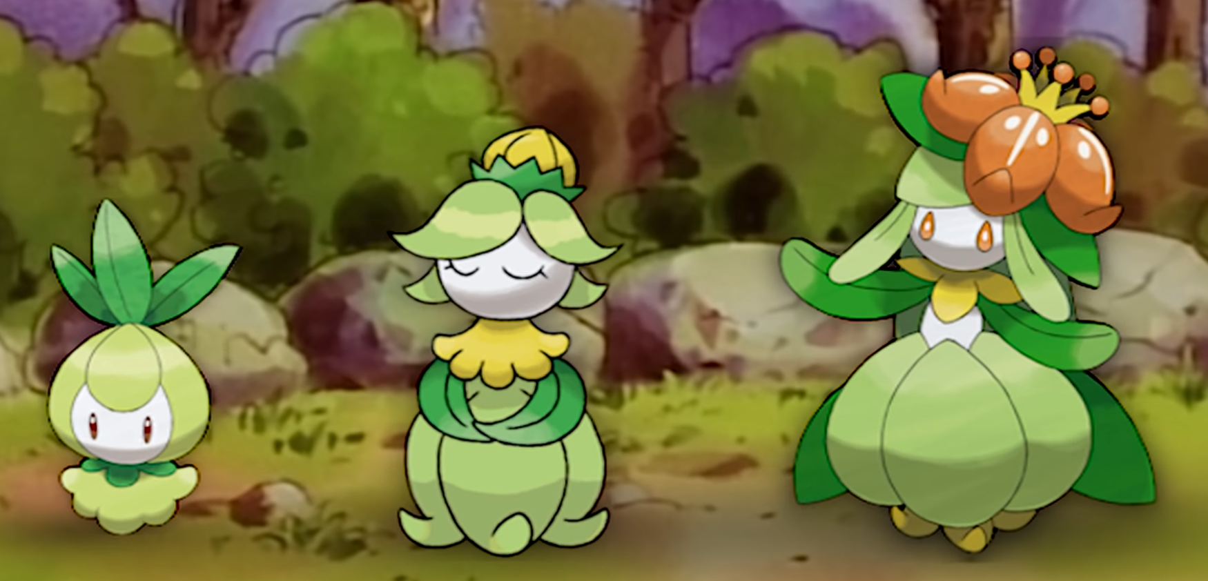
It’s rare for Game Freak to reveal details about scrapped Pokemon to the public, so it’s great that Sugimori was willing to share that the Petilil family was cut down from a three-stage evolutionary line to just two. Unfortunately, no further details about this missing Pokemon have ever been revealed. We don’t even know for sure which stage was scrapped — although I’m pretty certain it was the middle stage, as I explain in my video on the subject. Sugimori says they had an oversupply of Grass Pokemon — of the 156 new monsters added to the Pokedex in Generation 5’s release versions, 20 were Grass types.
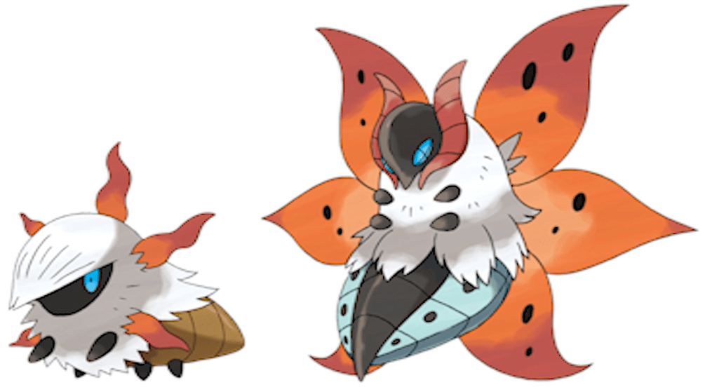
Larvesta • Volcarona
Sugimori: “In the first half of development, ideas for Pokemon designs came pretty easily. But once we put them all together, we realized some elemental types weren’t well-represented. So we worked to fill those gaps in the latter half of development. For example, ‘There isn’t enough type X, so we’ll plan to have that Pokemon type appear in the second half of the game at this kind of place’ — those are the types of orders that come down from the planners.”
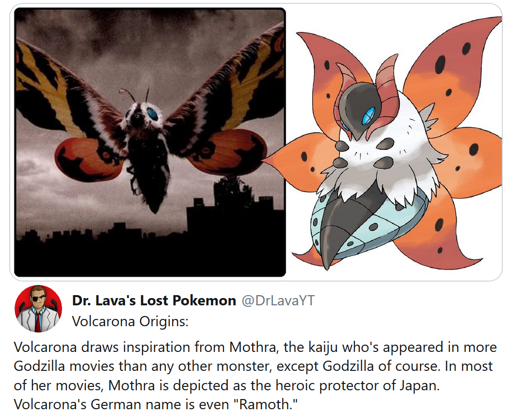
Sugimori: “In Volcarona’s case, we decided it would be a strong Bug/Fire type Pokemon that would appear in ruins. From there, the design team considered, “Well, what’s a strong insect?” There hadn’t been a Pokemon with a moth motif in a long time, so we decided to create a strong and majestic moth. We gave it 6 wings that look like the sun — we thought that boosted its sense of majesty and dignity. Plus, Volcarona is the Champion’s signature Pokemon, so we made sure its appearance made it look strong. In Larvesta’s case, the parts that come out of his neck are a reference to the Tower of the Sun.”
Omura: “Volcarona used to have 4 wings. But it just didn’t sit right with me. With only 4 wings it just resembled a regular moth, so we decided to give it 6 wings — which we felt made it look significantly more powerful.”
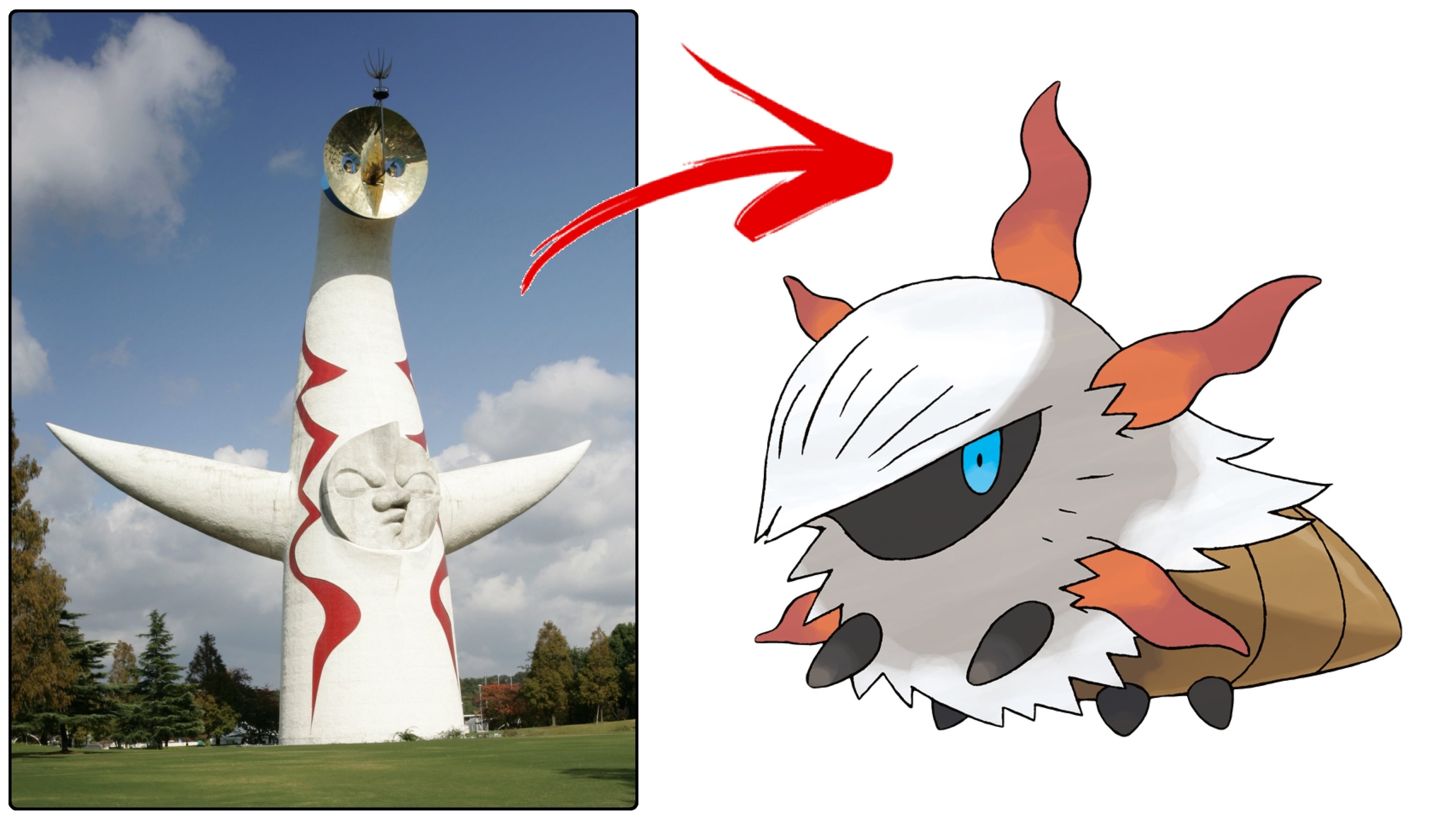
Dr Lava’s notes: Taiyō no Tō, or “the Tower of the Sun,” was built as the symbol of the 1970 World’s Fair in Osaka, Japan. It stands 230 feet tall and is adorned with three faces — a black face on the backside symbolizes the past, the face between the two arms symbolizes the present, the face at the top symbolizes the future. The streaks of red on its side are meant to represent thunder.
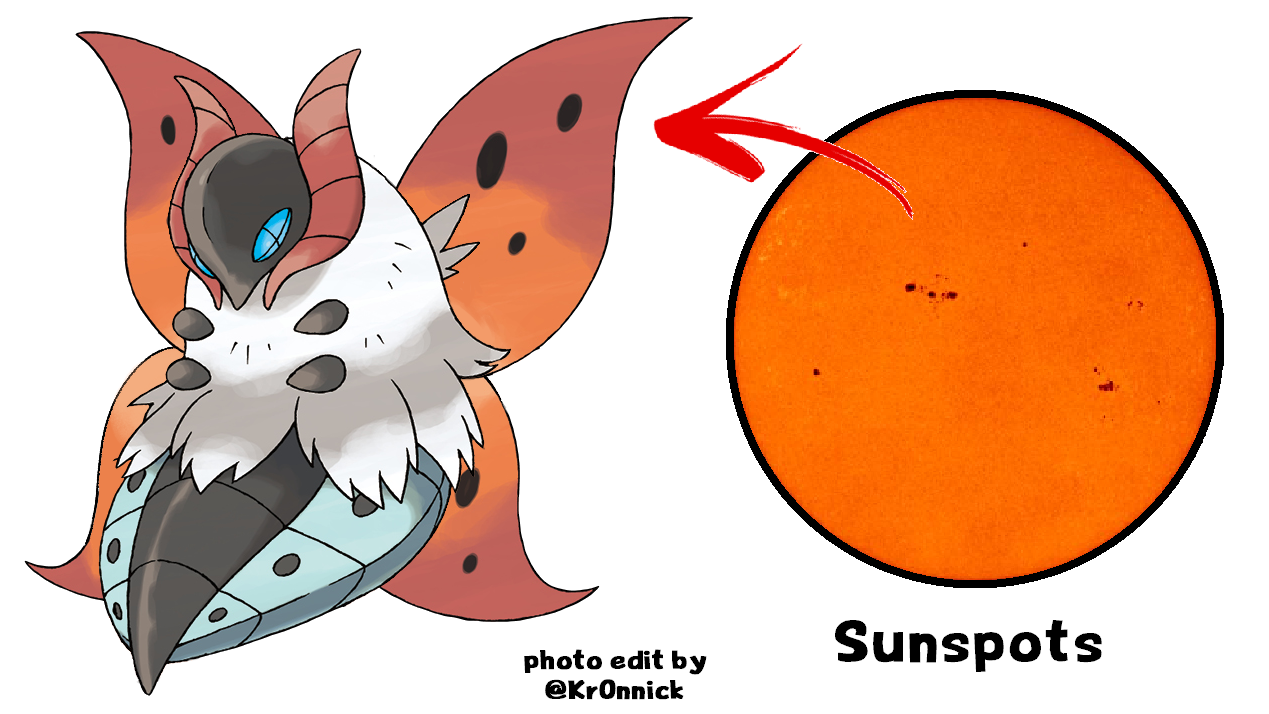
The dark spots on the sun symbolized on Volcarona’s wings, often called sunspots, are caused by temperature fluctuations on the surface of the sun. Sunspots can grow large enough to be visible without the aid of a telescope, and can last in duration from a few days to a few months, but ultimately they always decay.
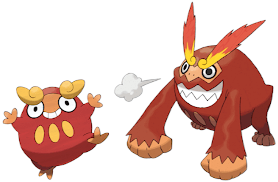
Sugimori: “These were created by one of our design team’s newcomers. Their creation was inspired by the designer’s experience at a festival burning Japanese Daruma dolls. The Daruma dolls at this festival happened to look like gorillas. So that’s how the concept for a Fire-type gorilla Pokemon resembling a Daruma doll was born.”
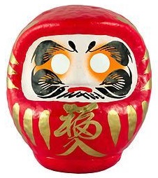
Dr Lava’s notes: It’s possible Mana Ibe was the “newcomer” that designed Darumaka and Darmanitan, but there were ten new monster designers in Generation 5 — so without further clarification, we can’t know which designer deserves credit. Daruma dolls are hollow round dolls meant to symbolize perseverance and good luck. They come in a variety of designs, but typically they depict the monk Bodhidharma, the founder of the Zen tradition of Buddhism. At the end of each year in Japan, there is a traditional ceremony called the daruma kuyō in which Daruma dolls are returned to the temples where they were originally purchased — the dolls are then thanked for the good luck they brought over the past year, then burned. New Daruma dolls are then bought from the temple for the coming year, and the cycle begins anew.
Related Video: World’s First Recording of Gen 5’s lost Lock Capsule Event
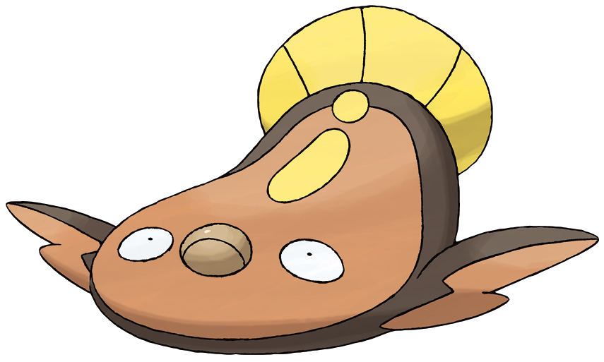
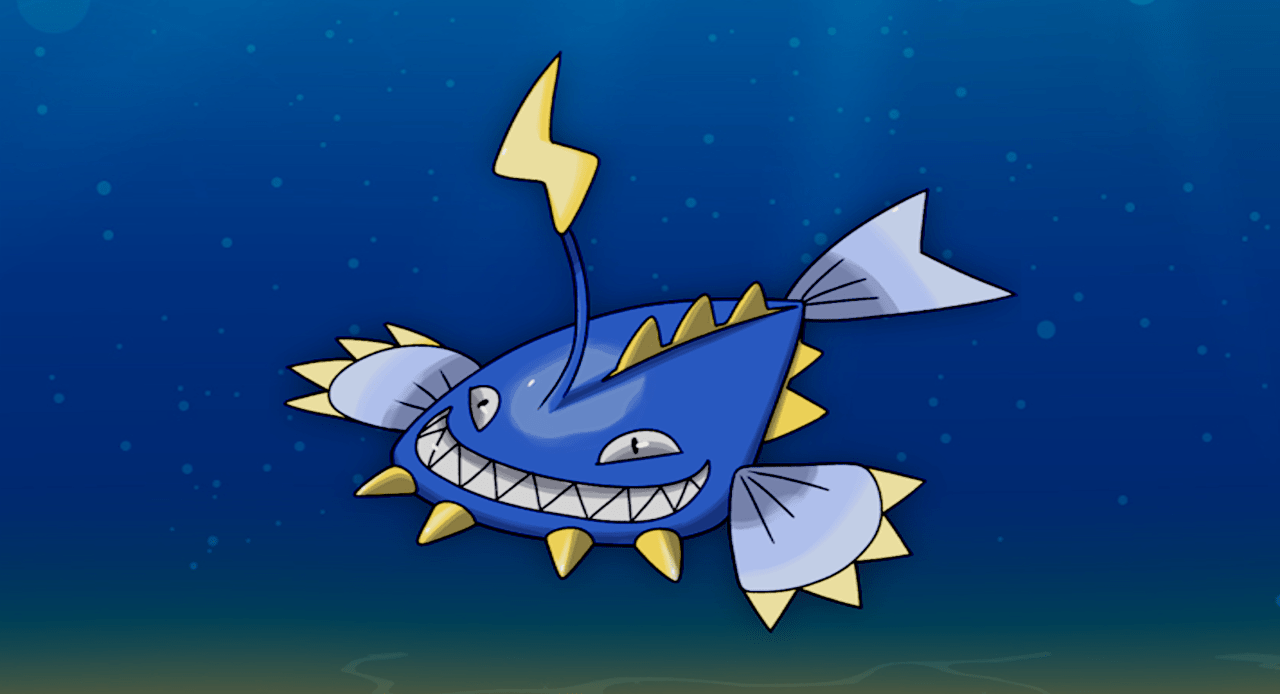
Stunfisk
Sugimori: “This was created by one of our design team’s newcomers. Stunfisk was born out of the designer’s desire to create the flattest Pokémon. Originally, Stunfisk was modeled after a goosefish, was blue in color, and was dual-type Water and Electric. But during the balancing phase of development, its type was changed and it ended up resembling a flounder. There was artwork drafted in which a person was zapped with an electric shock after stepping on a Stunfisk.”
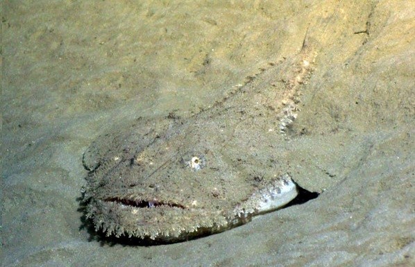
Dr Lava’s notes: Wow, what a transformation — Stunfisk ended up as a half-Ground brown flounder, but began as a half-Water blue goosefish. Goosefishes dwell on the ocean’s muddy bottom at depths over 1000 meters and boast large mouths full of sharp curved teeth. They’re very flat creatures, so it makes sense that a designer looking to create the world’s flattest Pokemon would choose a goosefish. That designer was Mana Ibe by the way — Junichi Masuda revealed her as Stunfisk’s creator in a February 2013 tweet.
It seems there were quite a few Pokemon in Gen 5 that had their elemental types changed late in development for the sake of balance. Then afterwards they must have felt it was necessary to alter their appearances as well, in order to better reflect their new typing. Like this next one for example…
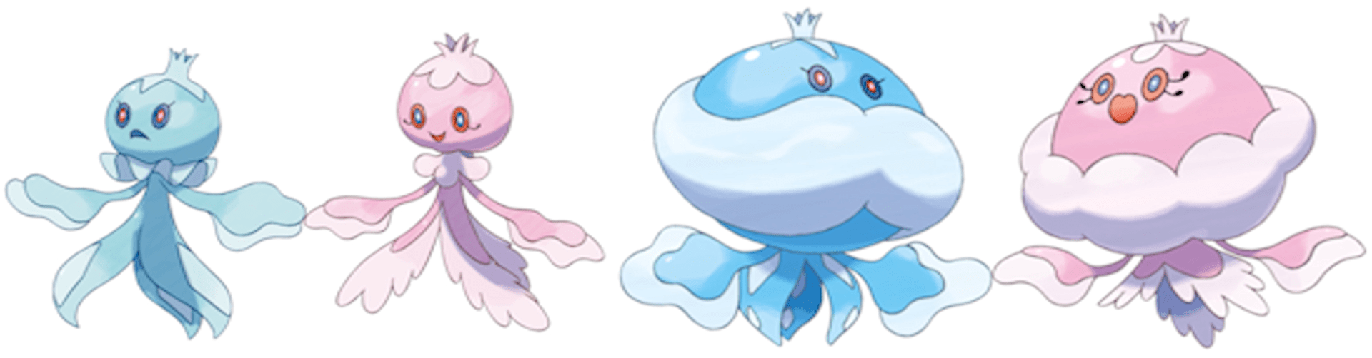
Frillish • Jellicent
Sugimori: “These were created by one of our design team’s newcomers all by themselves. At first these designs were modeled after a prince and princess, but during the balancing phase of development, Ghost was added to their typing. The Frillish family’s original designer was disappointed that they ended up as scary Pokémon.”
Dr Lava’s notes: So it sounds like Frillish and Jellicent were originally pure water types, then became half Ghost late in development when Game Freak was working on the Unova region’s elemental balance. In order for the new Ghost typing to make sense, it must have been at this point Frillish and Jellicent were given their creepy eyes, and possibly additional revisions were made as well. The designer isn’t identified, but it’s interesting to hear that they were upset to see their original vision for Frillish and Jellicent sacrificed for the sake of balance. Unlike the other designs that Sugimori credits to newcomers in this interview, with Frillish and Jellicent he specifies a newcomer designed them “all by themselves,” which makes it sound like the original designer was the one who made the required ghost-like alterations.
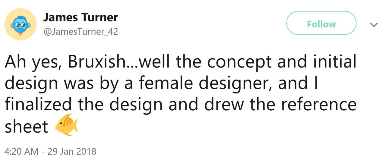
But that’s not always the case — Game Freak staff sometimes revise each others’ work. For example, James Turner revealed in a 2018 tweet that although a female team member was responsible for Bruxish’s initial design, he was the one that finalized it and drew the reference sheet. By the way, the day after volume 205’s interview translation was published on this website, James Turner tweeted that it was “a good read.”
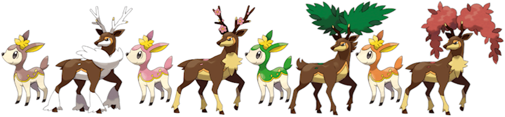
Deerling • Sawsbuck
Sugimori: “Once it was decided that a seasons mechanic would be implemented into the game, I thought I’d incorporate the mechanic into a Pokemon design as well. However, having seasons affect every Pokemon would be too difficult, so we decided to use it on just one or two. Sawsbuck was actually created before Deerling. We thought it would be interesting to represent seasons using its antlers. Usually, Grass-types and mammals don’t go well together, but the antlers kind of act as a bridge in this case. Then Deerling was designed to match Sawsbuck’s appearance.”
Dr Lava’s notes: The evolution of Sawsbuck’s design is actually a pretty fascinating one that doesn’t seem to have been reported on previously, at least not in the West. But since that information isn’t covered in this interview, I’ve decided to break it all down in this YouTube video — including an enhancement and translation of Sawsbuck’s 2009 concept art.
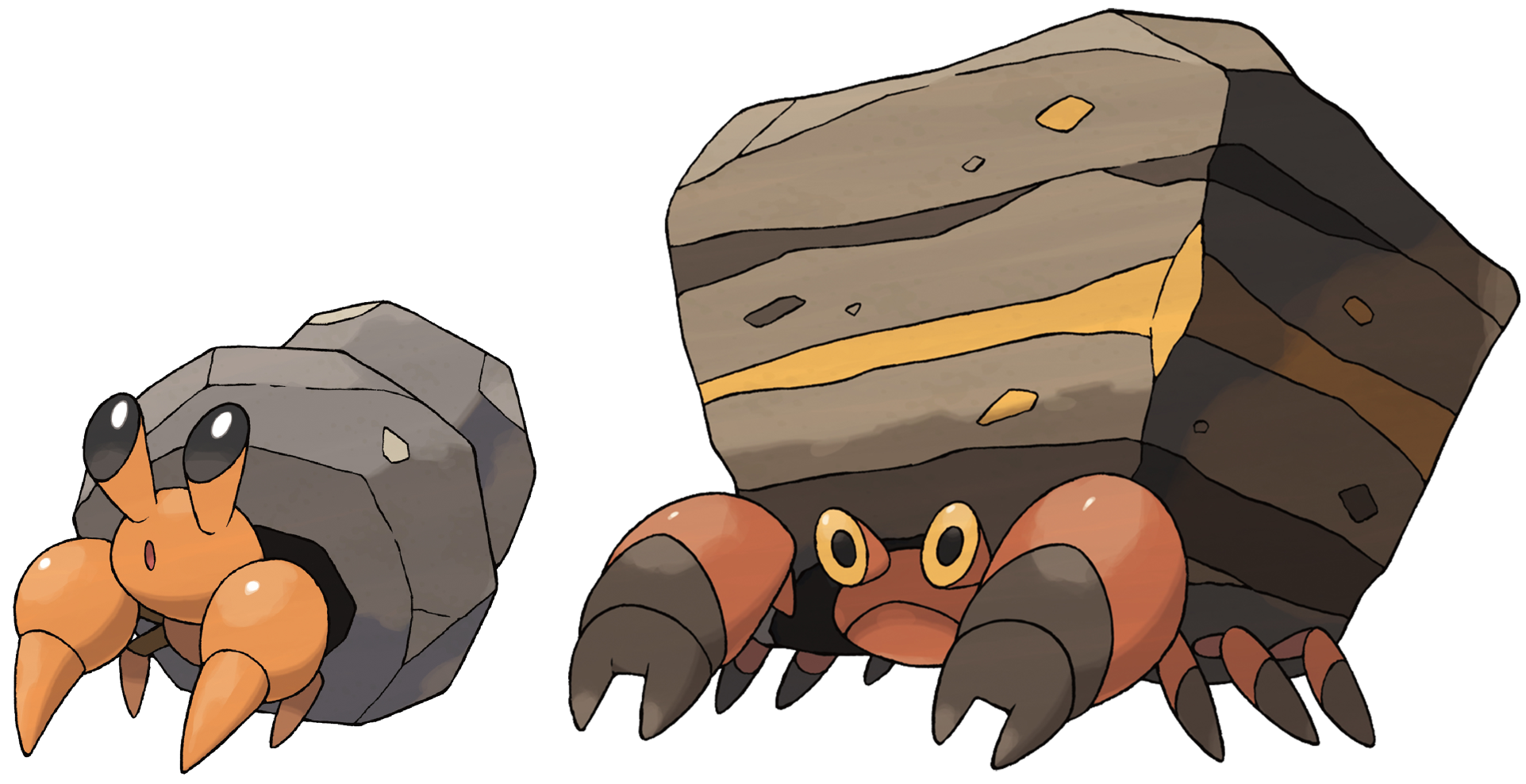
Dwebble • Crustle
Sugimori: “Originally, Dwebble and Crustle’s shells were supposed to be made from kiln-fired pottery, which would have made them ‘Furnace Pokémon.’ But we ended up revising the shells and giving them sharper angles, because we thought the original designs looked slow and awkward.”
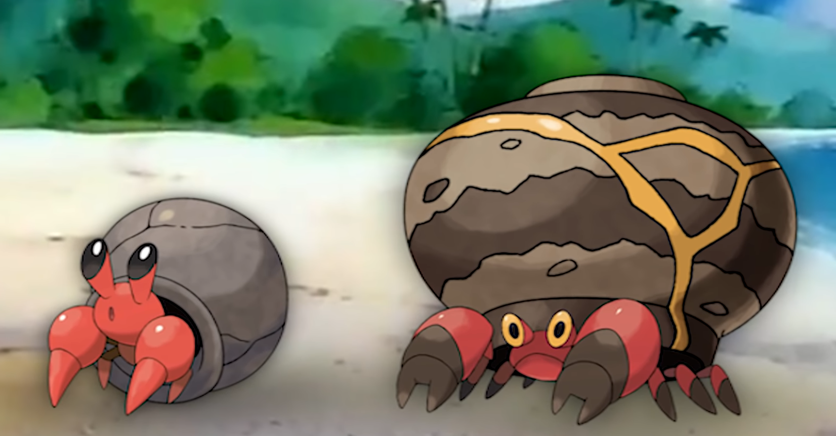
Dr Lava’s notes: So while Dwebble and Crustle were originally designed as ‘Furnace Pokemon’ with ceramic shells, they were ultimately revised into the designs we know today — Dwebble the ‘Rock Inn Pokemon,’ and Crustle the ‘Stone Home Pokemon.’ It’s impossible to know for certain, but as Furnace Pokemon, it’s likely they were originally half Fire-type — a possibility I explore in my YouTube video analyzing these translations.
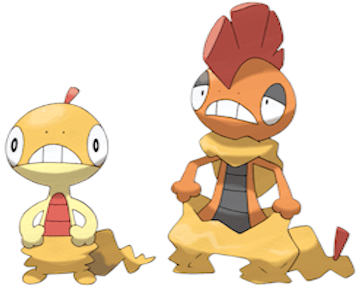
Scraggy • Scrafty
Sugimori: “These were designed around the concept of low-worn baggy pants. It was difficult to communicate the concept that they’re actually carrying around their shed skin, but in the end it was made possible thanks to the sprites’ animations.”
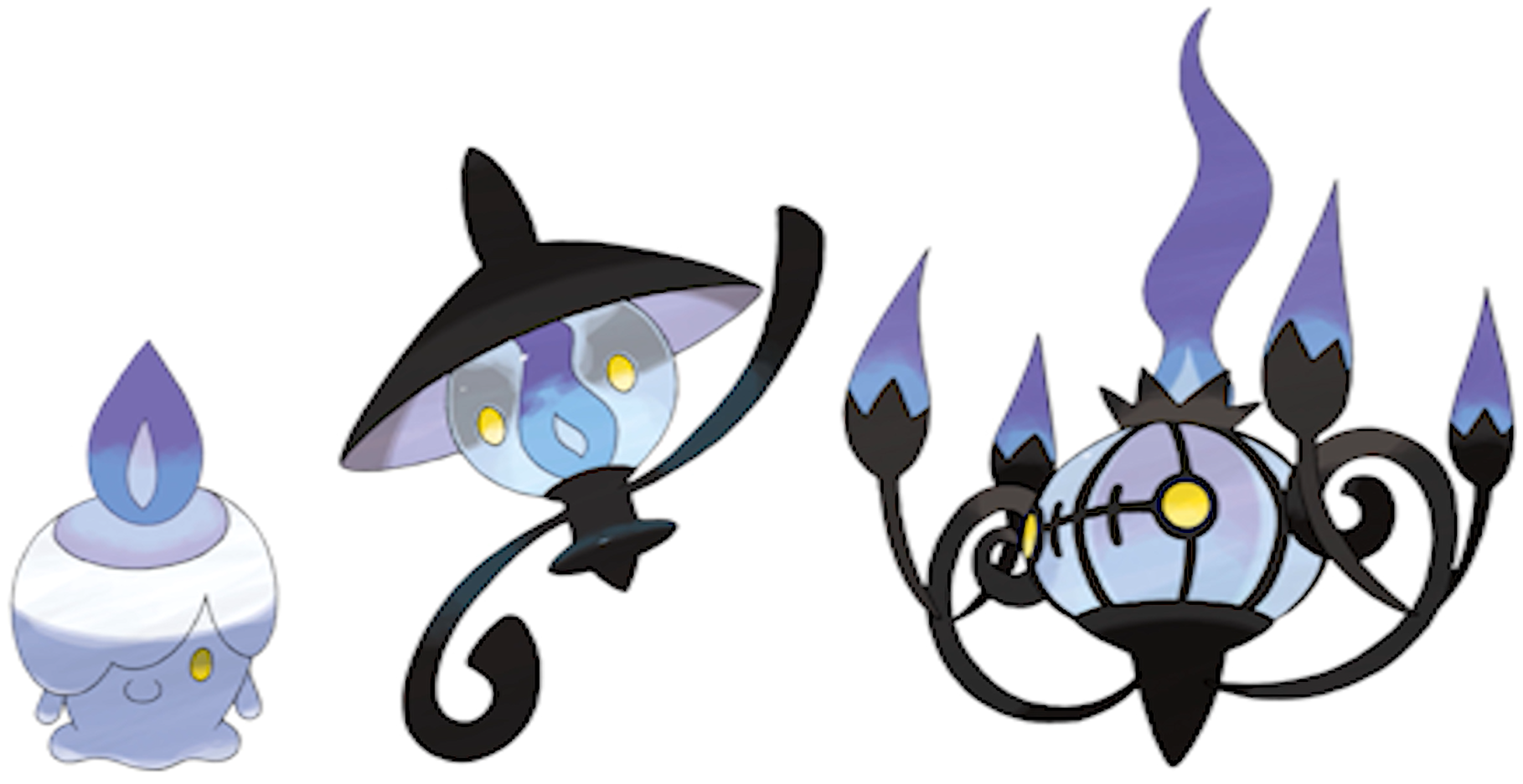
Litwick • Lampent • Chandelure
Sugimori: “The original concept was to create a Pokémon family that starts as a flame, then a candle, and finally a lamp. But the idea that a flame evolved into a candle wasn’t really working, so we ended up switching the candle’s position to make it the family’s first form.”
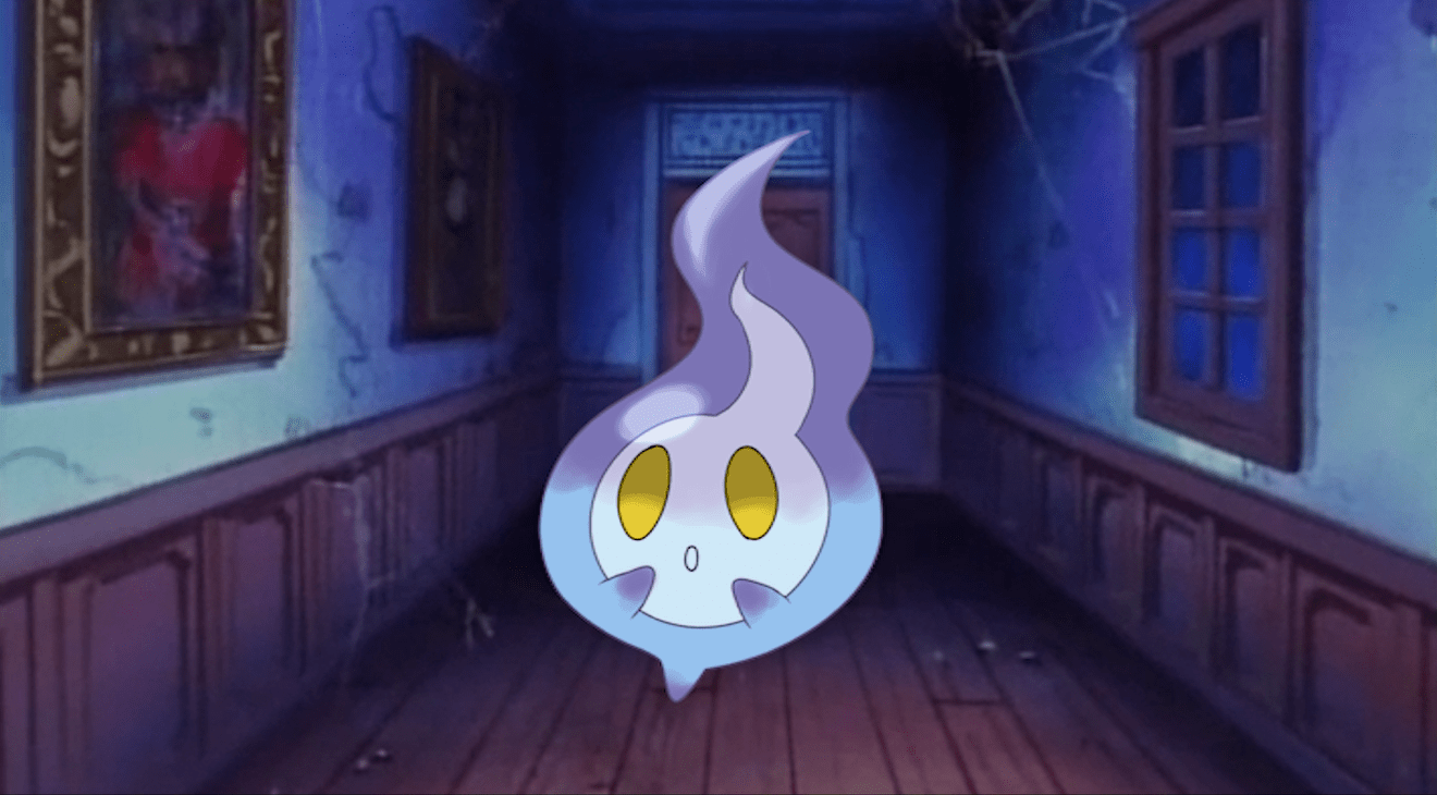
Dr Lava’s notes: So the idea for a first-stage flame Pokemon was scrapped entirely, and in its place a chandelier was chosen as the family’s third stage. It sounds like artwork for this flame creature is almost certainly taking up space in Game Freak’s vaults. But even though it’s unlikely that artwork will ever be released publicly, it seems we’ve managed to find one more lost Pokemon.
Related Interview: Sugimori says hundreds of Pokemon created for Gen 2, but most were cut
More Translations in Progress
And that wraps up Nintendo Dream volume 204’s feature on the origins and development of thirty-six Gen 5 Pokemon. I’m still looking for more issues of Nintendo Dream, so if you’ve got a lead on any of these magazines — or want to contact me for any reason at all — you can find me on Twitter where I’m @DrLavaYT.
Translations of volume 201’s interview and volume 205’s interview have now been published as well. But there are lots more Japanese interviews that need to be located and purchased from Japan, then translated by a professional interpreter. So if you’d be willing to sign up for a monthly pledge on my Patreon page, it would really make a huge difference in helping make more translations possible.
Thank you to Patreon Supporters
I want to thank my Patreon supporters, who help fund the continuation of my YouTube channel and this website: Reoko, Kavan Green, Kevin Comiskey, Brad Benson, Boreas Bear, Besipeitl, Jacky H, Evan Miller, Elvin Alfonso, Todesspiel, Austin Elliot, KissShot, HelpMePlease, Kenji Castro, Jonathan Henn, and Justin Stackhouse. Without their support, none of this would have been possible. Cheers guys, and to everyone who took the time to read this article.
Related Articles:
• Gen 5 Historia: Pokemon Origin Stories (Part 3)